Inside a Black and White Luxury Villa: Full Home Tour
Hamdaan | Home Tours & Inspiration Curator | 6+ Years Experience
Some homes whisper. This one speaks in contrasts.
Spread across three floors and approximately 4,500 sq ft, this monochrome luxury villa is designed for a family of five to six. It balances quiet luxury with everyday living, without sacrificing either.
Every room tells the same story differently: bold contrast, soft texture, and materials chosen with intention.
As London-based interior designer Kelly Hoppen puts it:
“Black and white is not a colour scheme. It is a discipline. Done well, it brings architecture to life.”
So let us walk through it, floor by floor, room by room.
Villa at a Glance
Before stepping inside, it helps to understand the layout.
Basement: Home theatre, parking, service zone Ground floor: Entrance lobby, living room, kitchen, master bedroom, two bathrooms, one standard bedroom First floor: Family living room, optional second kitchen, second master bedroom, bathroom, standard bedroom, balcony terrace
The design clearly separates formal entertaining from private family life. That separation is what sets well-planned luxury homes apart.
The Main Entrance

The ornate iron door immediately sets the tone. Framed by climbing foliage and warm portico lighting, it signals arrival without announcing it too loudly.
Steps lead up in a way that feels formal yet welcoming. The landscaping is deliberate. Structured greenery softens the hard architectural lines.
American designer Nate Berkus once noted:
“A front door should make you feel something before you even open it.”
This one does exactly that.
Entrance Lobby

Step inside and the polished marble floor takes over immediately. Veined, expansive, and reflective, it handles both light and purpose with ease.
The staircase rises cleanly through the space. Natural light falls from above, calibrated rather than accidental.
This lobby transitions you from the outside world into a quieter one. No visual noise. Just space, material, and stillness.
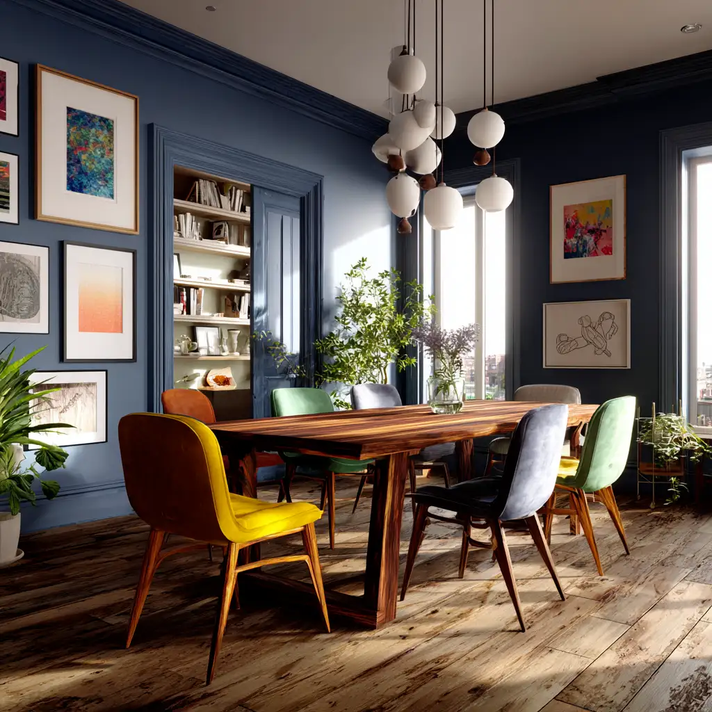
Living Room


Low-profile sofas. Oversized abstract artwork. Floor-to-ceiling windows.
The room pulls off something genuinely difficult. It feels editorial and comfortable at the same time. Dark walls meet white upholstery and the contrast creates depth without drama.
Lighting here is layered thoughtfully. Ambient, task, and accent sources work together so the space shifts naturally with the time of day.
As Jonathan Adler puts it:
“A living room should be a fantasy, but one you actually want to come home to.”
The furniture arrangement encourages conversation. Nothing faces a wall for the sake of it.
Kitchen


The open-plan kitchen anchors the ground floor with confidence.
A generous island runs through the centre, practical in flow and luxurious in material. Cabinetry sits in matte black with brass hardware that catches light without demanding attention.
Full-height windows keep the space from feeling heavy. Natural light does the heavy lifting here.
British kitchen designer Tom Howley describes this approach well:
“The best kitchens work hard behind the scenes. The materials carry the beauty; the layout carries the function.”
The second kitchen upstairs follows a similar logic, though brighter and more casual. It serves the family’s daily rhythm rather than formal entertaining.
Master Bedrooms


Dark panelled walls. A deep velvet headboard. Layered linens in cream and charcoal.
The primary suite earns its name. It is genuinely restful because every decision here points toward calm. Lighting drops low in the evening. The palette stays tight. No unnecessary surfaces, no decorative clutter.
New York designer Vicente Wolf, whose monochrome interiors are studied across design schools, puts it clearly:
“A bedroom should be the most personal room in a house and the most stripped back.”
The second suite on the first floor takes a lighter approach. Warm wooden floors and a crystal pendant overhead soften the palette considerably, making it feel less formal and more human.
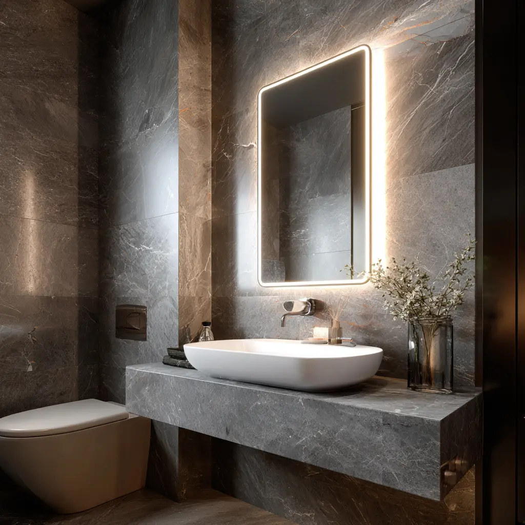
Bathrooms


Three bathrooms. Three distinct moods. One consistent standard.
The primary bathroom pairs black stone walls with brushed brass taps. The contrast is striking but never cold. Low-lensed fixtures turn this into a private spa experience.
The second bathroom on the ground floor balances pale stone against dark trim, with texture doing the work that colour usually does.
On the first floor, a freestanding tub sits below a strip of natural daylight. Minimal fittings let the veined stone walls lead.
French interior architect India Mahdavi notes:
“A bathroom should reward the senses: touch, sight, temperature. Luxury is not about size. It is about considered detail.”
Brass fittings and honed stone surfaces run consistently across all three spaces. That continuity is what makes the home feel designed rather than assembled.
Standard Bedrooms


Both rooms follow the same design logic: quiet palettes, layered textiles, and deliberate simplicity.
Neither feels like an afterthought. The bedding is tailored. The lighting is warm. Soft shadows replace harsh overheads.
These rooms work because they do not compete with the rest of the villa. They offer rest, and they deliver it quietly.
Family Living Room
The first-floor family space is less formal than its ground-floor counterpart. Layered rugs, neutral-toned furniture, and softer lighting create a room built for everyday life.
Open in layout but divided naturally by furniture, it handles both movie nights and quiet Sunday mornings equally well.
As Belgian designer Axel Vervoordt describes it, this is a room built around wabi: the Japanese concept of beauty found in quietness and imperfection. Everything here settles rather than shouts.
Home Theatre

The basement home theatre is the villa’s most dramatic space.
Tiered reclining seating faces a full cinematic screen. Acoustic panels line the walls. Lighting drops to near-zero when a film begins.
This is not a TV room with a bigger screen. It is a proper theatre, designed to remove every distraction between viewer and story.
Furthermore, the basement placement means sound stays completely below the house. The family above hears nothing. The film gets
What Makes This Villa Work
This black and white luxury villa succeeds because it holds one design idea firmly across every room. Contrast is its language. Stone, velvet, brass, and dark panelling are its vocabulary. Restraint is its grammar.
Kelly Hoppen summarises it simply:
“Every material should earn its place. If it does not contribute, remove it.”
Nothing here is accidental. That is what ultimately separates a well-decorated house from a well-designed home.
Designer Takeaways at a Glance
| Space | Standout Feature | Why It Works |
|---|---|---|
| Entrance | Polished marble flooring | Sets the tone on arrival |
| Living room | Low sofas and abstract artwork | Gallery calm, liveable comfort |
| Kitchen | Island and brass hardware | Practical meets luxurious |
| Primary suite | Velvet headboard, dark panels | Intimate and deeply restful |
| Bathrooms | Honed stone and brass fittings | Consistent material language |
| Home theatre | Tiered seating, acoustic panels | Fully immersive experience |
For more on minimalist monochrome interiors, explore how Architectural Digest defines the balance between modern calm and bold contrast.
https://www.architecturaldigest.com/story/monochrome-interior-design
Elle Decor also highlights how black-and-white spaces can feel timeless yet warm when layered with natural textures and subtle lighting.
https://www.elledecor.com/design-decorate/color/g27338135/black-and-white-room-ideas/
AUTHOR
Written by Hamdaan | Home Tours & Inspiration Curator, 6+ years.
Hamdaan curates residential tours and design inspirations, translating architecture, decor themes, and layout choices into accessible style breakdowns for readers.
Experienced working with multiple design content brands. About Us
Recent Posts
Matter 1.5: The Smart Home Revolution Finally Arrives in 2025

Best Bathroom Flooring Ideas: Complete Expert Guide for 2026
Top 10 Upcoming Smart Home Gadgets of 2026 Everyone Is Waiting For