Spring Color Palette 2026: Light, Warm, Bright & Soft Hues for Every Room
Written by: M. Yazdaan, Home Decor Editor
Reviewed by: Emma Cartel, Research & Editorial Standards Coordinator
Spring 2026 brings color palettes that balance comfort with personality. Instead of chasing trendy shades that quickly fade, this year focuses on four distinct families: light, warm, bright, and soft. Consequently, each palette serves different moods and room functions.
This guide breaks down which colors work where, backed by designer insights and professional recommendations. Moreover, whether you’re repainting one wall or planning a whole-home refresh, you’ll find practical direction here.
Why Spring 2026 Color Palettes Matter
Color choices directly affect how you experience your space daily. Additionally, spring palettes in 2026 reflect a shift toward intentional living colors that support function and feeling.
According to the Pantone Color Institute, nature-inspired hues dominate consumer preferences across USA, UK, Canada, and European markets.
Designer Tip: Test paint samples in both morning and evening light. Colors shift dramatically based on natural light exposure.
Light Spring Color Palette: Cool, Calming, and Airy
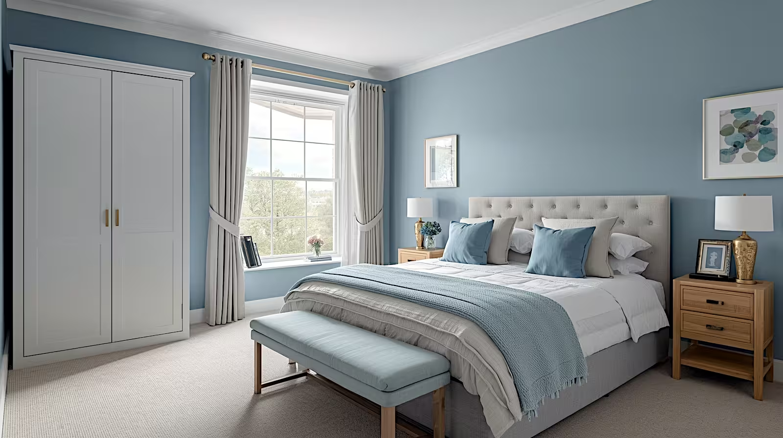
Light spring palettes center on cool, recessive tones that make rooms feel larger. Think blue-grays, soft dove, pale aqua, and whisper greens. Therefore, these colors work particularly well in bedrooms, bathrooms, and spaces where calm matters.
The bedroom shown demonstrates how blue-gray walls create instant serenity. Paired with gray upholstered furniture and white trim, the palette stays sophisticated. Additionally, this combination works across modern, traditional, and transitional interiors.
Key Colors in Light Spring Palette:
- Steel blue-gray: Ideal for bedrooms and home offices
- Pale aqua: Perfect for bathrooms and powder rooms
- Soft dove gray: Works in any room needing neutral calm
- Whisper sage: Adds subtle warmth to cool-toned spaces
Light palettes succeed because they reflect natural light effectively. According to Architectural Digest, cool-toned grays and blues remain top choices due to their versatility.
Designer Tip: Layer different shades within the light palette using textiles. Monochromatic doesn’t mean boring when you vary texture.
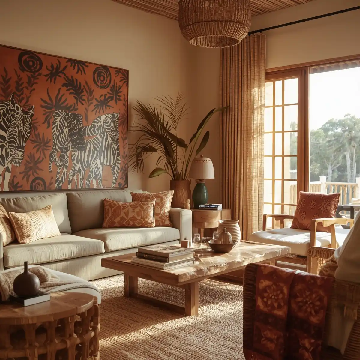
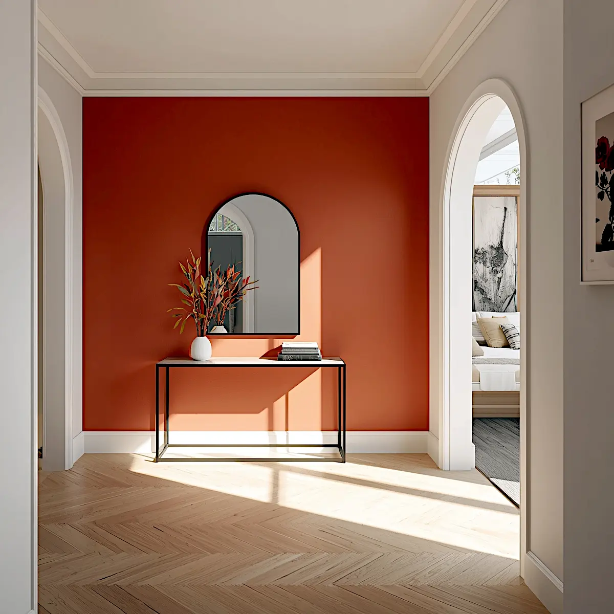
Warm Spring Color Palette: Earthy, Grounding, and Inviting
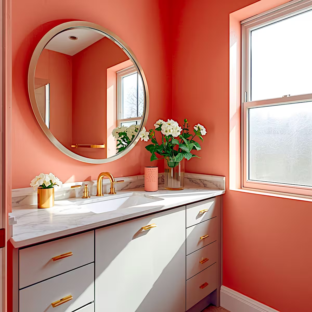
Warm spring color palettes bring coral-peach, soft terracotta, rust, and clay tones into focus. Consequently, these earthy hues create instant warmth and work exceptionally well as accent walls or in transitional spaces.
The bathroom demonstrates soft coral-peachy tones that feel both bold and inviting. Rather than overwhelming, the warm peachy-coral creates a cocooning, spa-like atmosphere. Furthermore, white cabinetry and marble countertops balance the warmth beautifully.
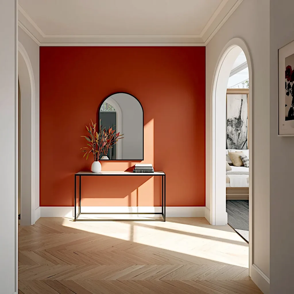
Similarly, the entrance hallway uses deep rust-terracotta as a dramatic statement wall with an ombre effect from burgundy to burnt orange. This bold approach immediately establishes a memorable, warm welcome. Furthermore, the richer, more saturated terracotta creates striking impact perfect for entryways.
Best Applications for Warm Spring Colors:
- Accent walls in living rooms and entryways
- Full bathroom walls for spa-like warmth
- Powder rooms and transitional spaces
- Kitchen backsplashes with neutral cabinetry
Warm palettes pair beautifully with white cabinetry, marble, brass fixtures, and natural wood. According to designer Kelly Wearstler in her interview with Architectural Digest, “Coral and terracotta tones bring grounding energy that people crave after years of cool minimalism.”
Designer Tip: Use warm spring colors on one feature wall rather than entire rooms. This creates focal points without overwhelming spaces.
How to Style Warm Palettes
Warm colors have high visual weight, advancing toward you. Therefore, balance intensity by keeping adjacent walls neutral with cream, white, or soft gray. Moreover, add greenery for cooling contrast.
Use matte finishes and incorporate natural light. One bold wall surrounded by neutrals creates drama without chaos.
Bright Spring Color Palette: Energizing, Cheerful, and Social
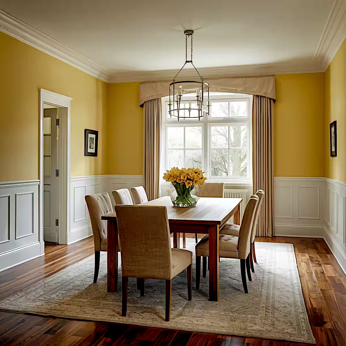
Bright spring palettes inject energy into social spaces. Butter yellow, sunny gold, and warm amber dominate this category. Consequently, the dining room example showcases butter yellow walls that transform the space into an inviting gathering area.
Yellow naturally stimulates conversation and appetite, making it ideal for dining rooms. Paired with wood furniture and natural light, the color feels warm rather than overwhelming.
Where Bright Palettes Excel:
- Dining rooms and breakfast nooks
- Kitchens with ample natural light
- Home offices needing creative energy
- Sunrooms and southern-facing spaces
Bright palettes require careful balance. Too much saturation creates visual fatigue. Therefore, the key lies in using bright colors on primary walls while keeping trim and ceilings neutral.
According to color psychology research published by the International Association of Color Consultants, yellow increases mental alertness and promotes positive social interaction. However, avoid bright yellows in bedrooms where calm takes priority.
Designer Tip: If full-wall bright yellow feels too bold, use it on lower wainscoting or kitchen cabinets paired with white countertops.
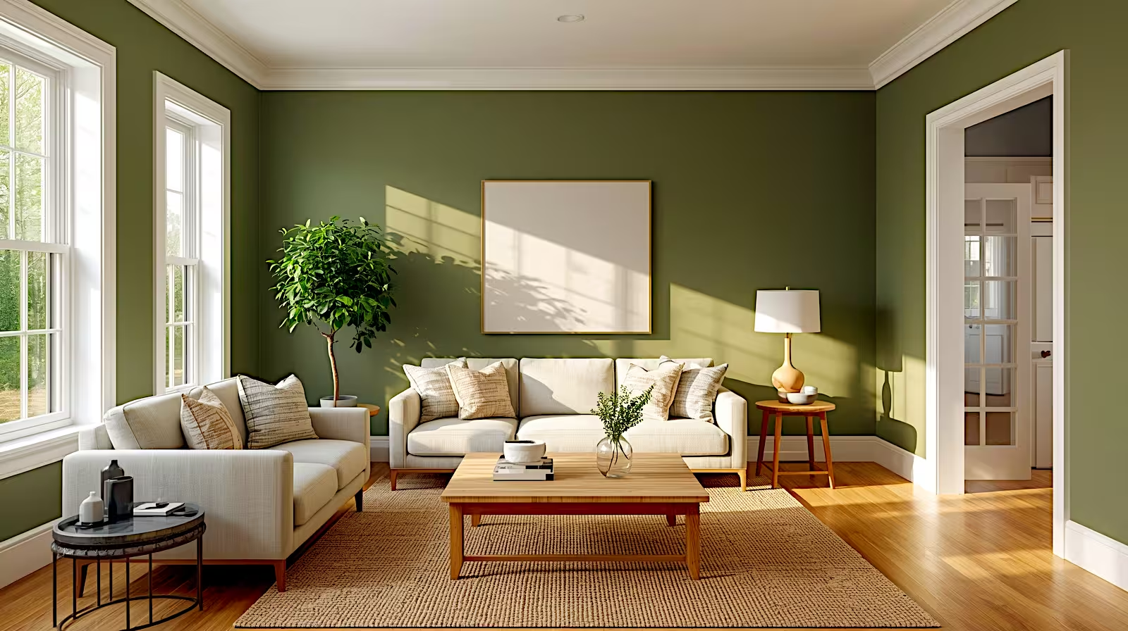
Soft Spring Color Palette: Muted, Nature-Inspired, and Versatile
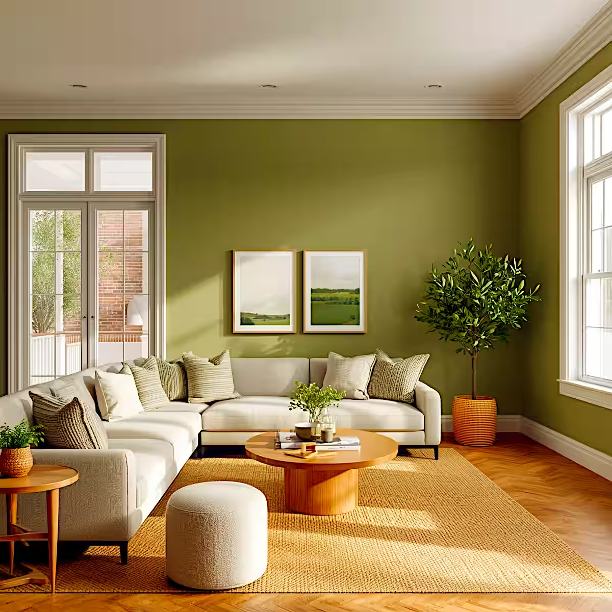
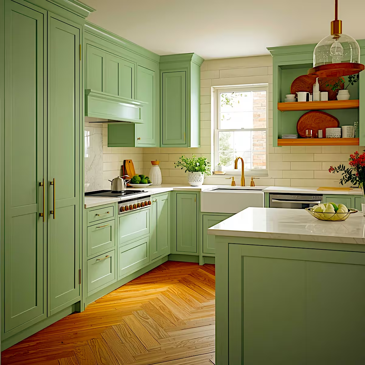
Soft spring palettes represent the most versatile option, featuring muted olive, dusty sage, mint-green, and moss tones. Therefore, these colors work across entire homes because they balance warmth and coolness.
The living room demonstrates warm olive-green walls with earthy yellow undertones that create a grounded, nature-inspired backdrop. This deeper, richer green feels both restful and sophisticated. Additionally, the earthy tone pairs beautifully with natural wood and cream furnishings.
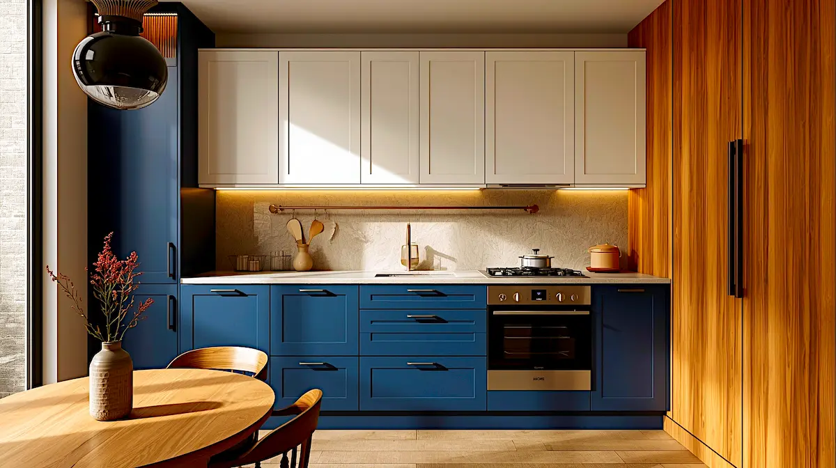
Meanwhile, the kitchen shows lighter mint-sage cabinetry with cool, fresh undertones paired with white countertops. This brighter, airier green brings a clean, contemporary feel while maintaining nature-inspired aesthetics. Furthermore, the cooler mint tone works particularly well in kitchens because it feels fresh and energizing without overwhelming the space.
Soft Palette Advantages:
| Benefit | Application |
|---|---|
| Whole-home cohesion | Use as primary color throughout multiple rooms |
| Style flexibility | Works with modern, farmhouse, traditional, coastal |
| Timeless appeal | Won’t feel dated in 3-5 years |
| Easy coordination | Pairs with almost any accent color |
Soft spring colors have staying power. Unlike trend-driven brights, muted greens remain relevant across design cycles. Interior designer Joanna Gaines noted in her Magnolia Journal that soft spring colors give you freedom to change accents without repainting.
Designer Tip: Soft palettes benefit from varied textures. Add linen, jute, wool, and natural wood to prevent monotony.
Choosing the Right Spring Palette for Your Room
Selecting your spring color palette depends on three factors: room function, natural light, and existing finishes.
Room Function Guide:
- Bedrooms: Light or soft palettes for relaxation
- Living rooms: Soft palettes for versatility
- Kitchens: Soft or bright palettes depending on cabinetry
- Bathrooms: Light or warm palettes based on size
- Dining rooms: Bright or warm palettes for social energy
- Entryways: Warm or bright palettes for impact
Lighting Considerations:
Rooms with abundant natural light handle bright and warm palettes better. Conversely, north-facing rooms benefit from light or soft palettes. Therefore, always test samples in your space.
Furthermore, consider existing finishes. Homes with cool-toned tile pair best with light palettes, while warm wood floors complement warm and soft palettes.
Combining Spring Palettes Across Your Home
You don’t need to choose just one palette. Successful homes blend multiple spring palettes strategically.
For open floor plans, use soft palette as foundation, then add warm accents in kitchen or dining zones. In separated rooms, experiment with different palettes per space. Additionally, use neutral hallways as transitions.
Maintain consistent trim color white or cream unifies varied wall colors. This approach creates visual interest without feeling disjointed.
Spring 2026 Color Palette: Final Recommendations
Spring color palettes in 2026 offer clear direction without restrictive rules. Light palettes deliver calm, warm palettes create impact, bright palettes energize, and soft palettes provide versatility. Your choice depends on lifestyle, lighting, and personal preference.
Start with one room and one palette. Observe how the color performs throughout the day and across seasons. Then expand gradually, building confidence in your color decisions.
Remember that paint is changeable. Unlike permanent renovations, wall color can be adjusted if needed. Therefore, spring 2026 is the perfect time to experiment with color in ways that genuinely improve your daily environment.
FAQs About Spring Color Palettes
Q1: What is the most popular spring color palette for 2026?
Soft spring palettes featuring sage green and muted earth tones lead 2026 trends due to their versatility and timeless appeal across different interior styles.
Q2: Can I mix different spring palettes in an open-concept home?
Yes, use soft palettes as your foundation throughout open spaces, then add warm or bright accents in specific zones like kitchen islands or dining areas.
Q3: Which spring palette works best in small rooms?
Light spring palettes make small rooms feel larger by reflecting natural light and creating airy atmospheres without visual weight.
Q4: How do I choose between warm and bright spring palettes?
Warm palettes work better as accent walls in transitional spaces, while bright palettes excel in social rooms with abundant natural light like dining areas.
Q5: Are spring 2026 color palettes suitable for rental properties?
Soft and light spring palettes work best for rentals because they appeal to broad audiences and coordinate easily with various furniture styles.
Q6: Do spring color palettes work in modern and traditional homes equally?
Yes, all four spring palettes adapt to different design styles through paint finish choices, trim colors, and complementary decor selections.
About the Author:
M. Yazdaan is a Home Decor Editor with 7+ years of experience specializing in residential interior styling, renovation trends, and material selection across living, kitchen, bathroom, and outdoor spaces. Contributing to multiple home-focused publications, M. Yazdaan helps homeowners make informed design decisions backed by industry research and real-world applications.
Fact-Checked by:
Emma Cartel, Research & Editorial Standards Coordinator with 8+ years of experience, oversees fact-checking, specification validation, sourcing integrity, and editorial standards for all published content. Her work ensures accuracy in measurements, costs, timelines, and industry data citations.
More about our editorial team: About Us

Small Kitchen Remodel Ideas: 15 Expert Design Strategies for 2026
Biophilic Smart Homes: Where Technology Speaks Nature’s Language