Beginner Decorating Mistakes That Age a Room Fast
Written by: M. Yazdaan, Home Decor Editor
Reviewed by: Emma Cartel, Research & Editorial Standards Coordinator (ABOUT US)
A room can have brand new furniture and still look dated the moment you walk in. That gap usually comes down to a handful of beginner decorating mistakes that have nothing to do with budget and everything to do with proportion, placement, and light. Most of these errors take five minutes to fix once you know what to look for.
This guide walks through ten of the most common mistakes homeowners make when they start decorating on their own, and the specific adjustment that corrects each one.
Beginner Decorating Mistakes to Fix First: The Rug
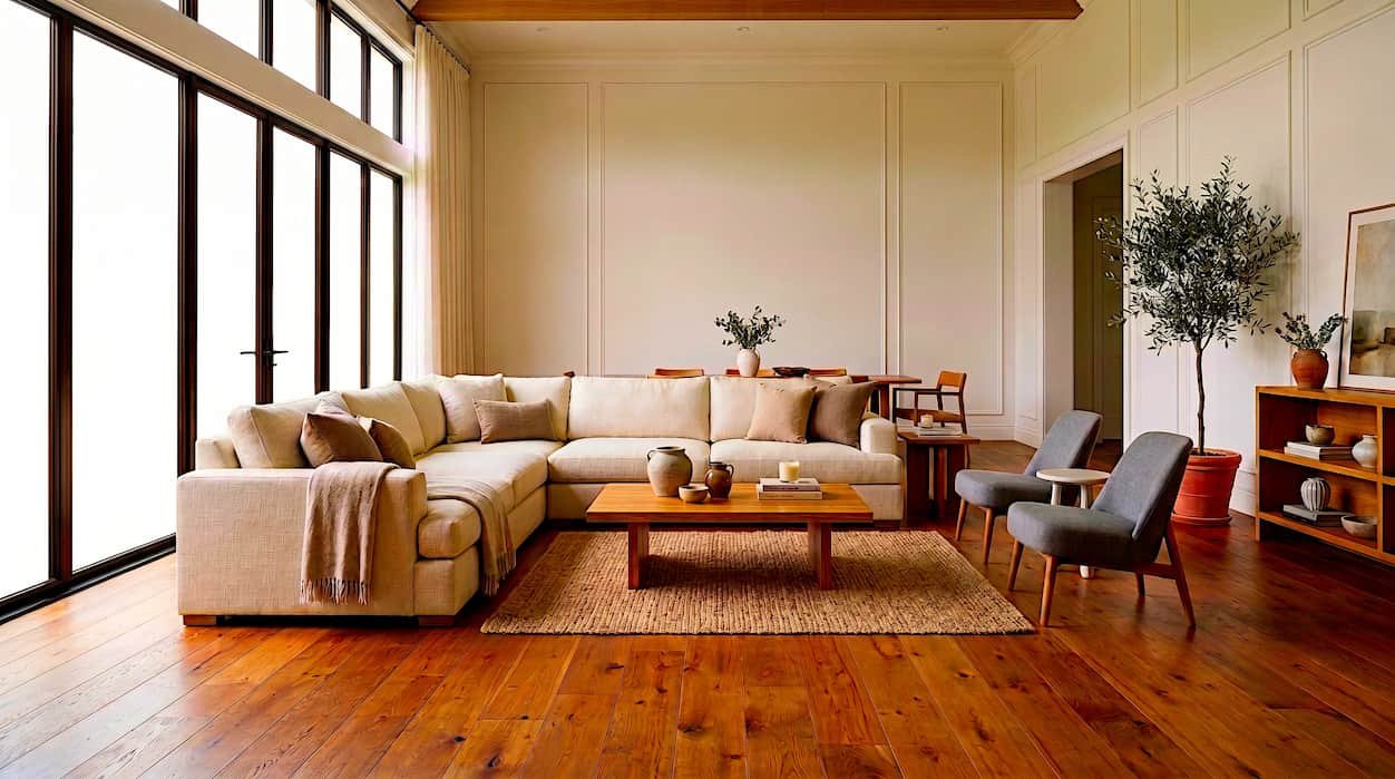
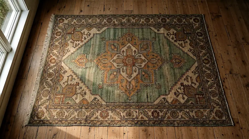
A small rug floating in the center of a large room is one of the most common beginner decorating mistakes on this list. It makes an otherwise well furnished space look disconnected, as if the sofa and chairs were never meant to sit together.
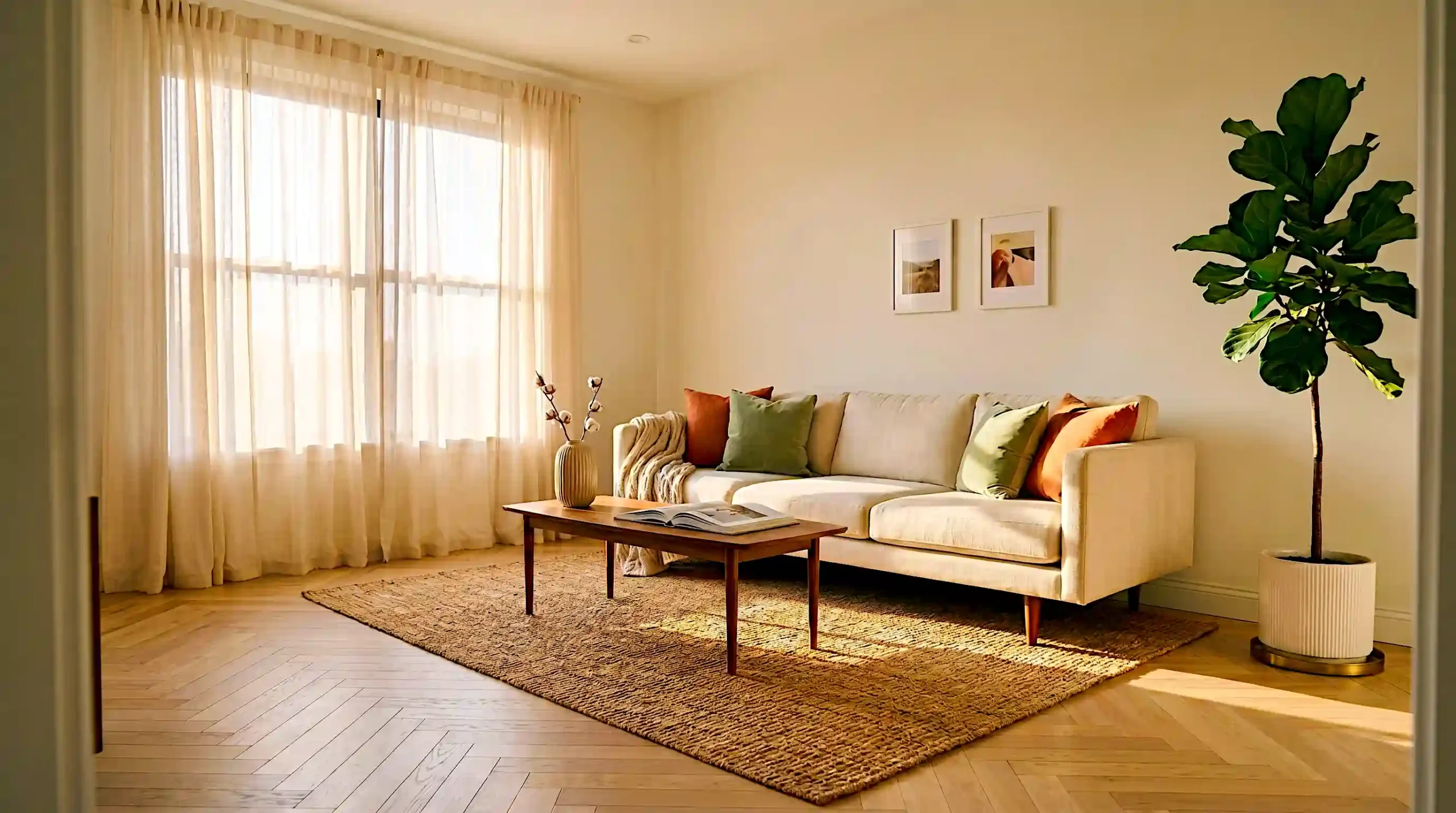
Designers consistently recommend sizing a rug to the seating group rather than the room itself. In a living room, the rug should extend at least 18 inches under the front legs of the sofa and any chairs facing it. Testing across different room sizes shows that even a modest rug looks intentional once every front leg makes contact with it.
If your budget only stretches to a smaller size, place the rug so the front legs of your main seating pieces touch its edge. That single adjustment fixes the floating look immediately and costs nothing beyond repositioning what you already own.
Furniture Pushed Against Every Wall
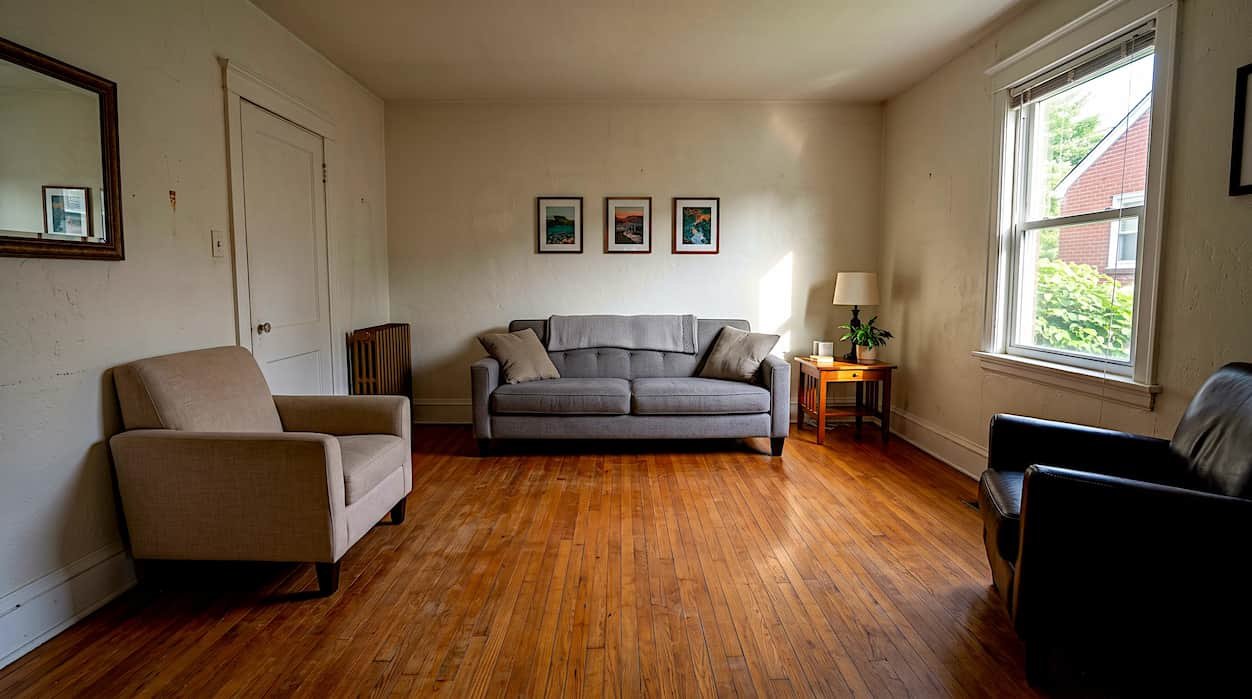
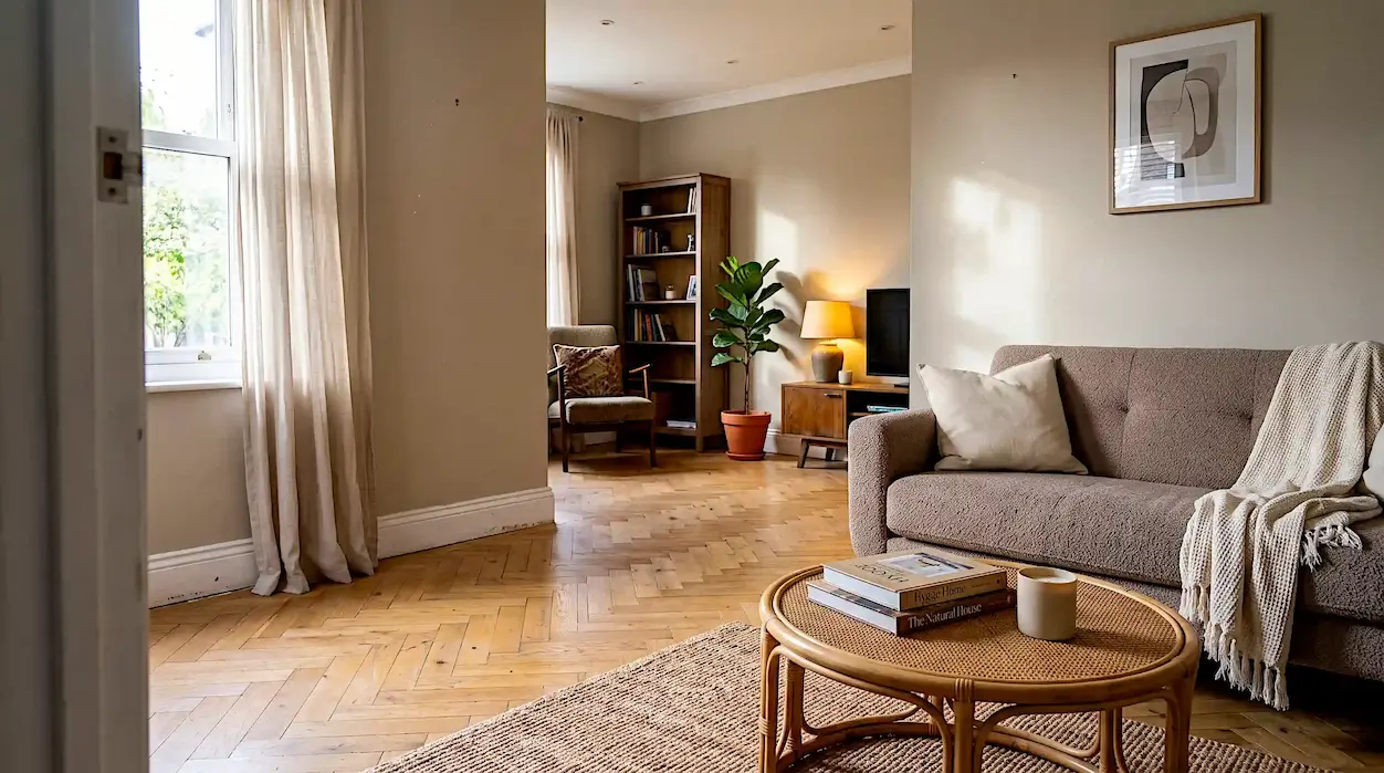
Lining every piece of furniture against the walls feels like the safe choice when you are decorating a room for the first time. In practice, this creates a dead zone in the middle of the room and pushes conversation to opposite corners, which works against how people actually use a living room.
Pull the sofa 6 to 10 inches away from the wall and angle the chairs slightly toward each other rather than facing straight ahead. Add a rug and coffee table in the center of the grouping so the seating shares a single focal area instead of framing an empty middle.
This adjustment matters more in small rooms than large ones. A compact space with furniture pulled inward reads as intentional and cozy, while the same room with everything against the walls reads as unfinished, even with identical furniture.
Mismatched Lighting Temperature
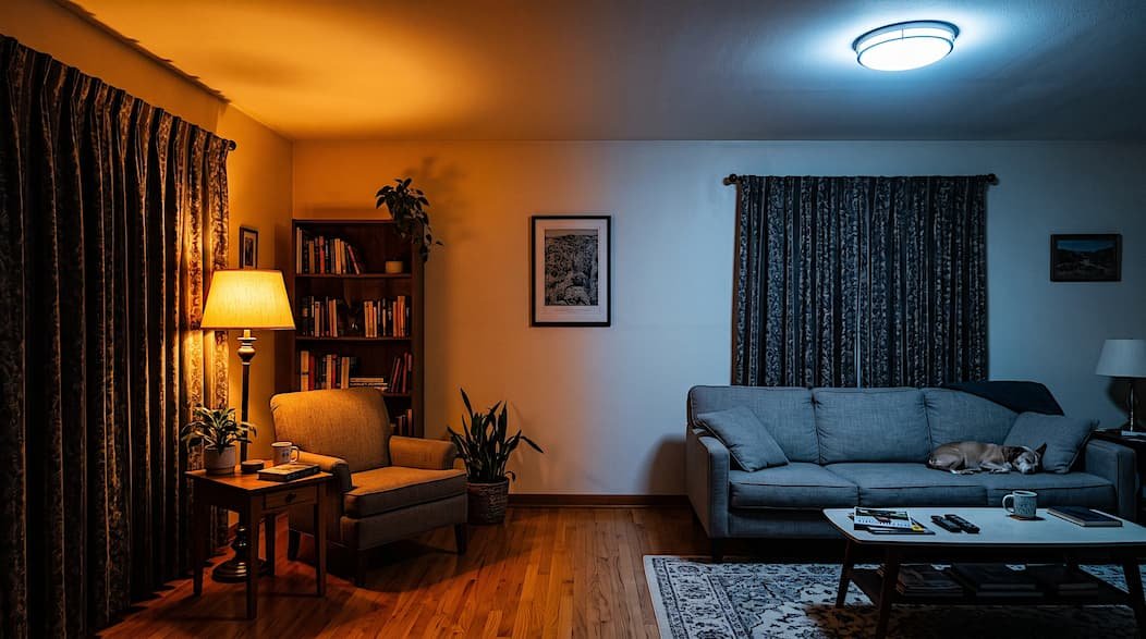
Warm bulbs on one side of a room and cool white bulbs on the other create an uneven, slightly clinical glow that no amount of styling can compensate for. This mistake is easy to miss because it only becomes obvious at night, once natural daylight is gone.
Every bulb box lists a Kelvin number, and that number should stay consistent within a single room. Warm white, in the 2700K to 3000K range, suits living rooms and bedrooms where the goal is comfort. Cool white, starting around 4000K, works better in kitchens and home offices where task visibility matters more than ambiance.
Checking this number before checkout takes a few seconds and prevents a mismatch that otherwise requires buying a second set of bulbs later.
An Overly Matched Furniture Set
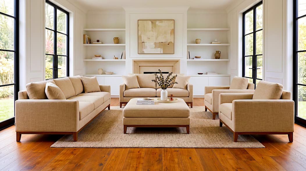
Buying a sofa, loveseat, and armchair from the same collection feels like the safest, most foolproof route for a first time decorator. The finished result often reads closer to a furniture showroom floor than a room someone actually lives in.
Keep one or two pieces from a matching set and swap the remaining pieces for something with a different shape, material, or finish. A leather armchair next to a fabric sofa adds contrast without clashing, as long as both share a common wood or metal tone.
The goal is one shared element across the room, such as a wood finish or color family, rather than matching every surface and cushion.
Ignoring Furniture Scale
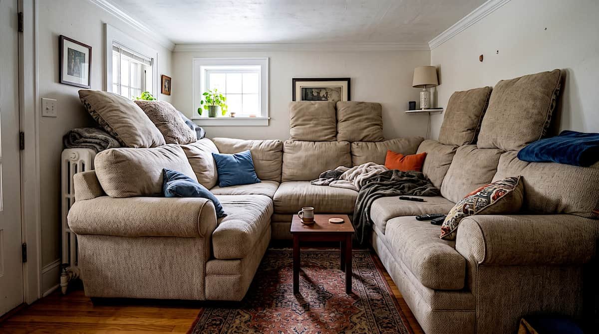
An oversized sectional crammed into a small living room, or a tiny coffee table paired with a large sofa, throws off the balance of the entire space. This mistake happens often because showrooms display furniture in a much larger space than most living rooms actually offer.
Measure your room before shopping, not after delivery. A coffee table should run roughly two-thirds the length of the sofa. Its height should sit close to the seat cushion for comfortable use. Leave at least 30 inches of clear walking space around any major piece of furniture.
This single measurement habit prevents most scale mistakes before you finalize a purchase, which matters more than any styling decision made afterward.
Skipping Layered Decor
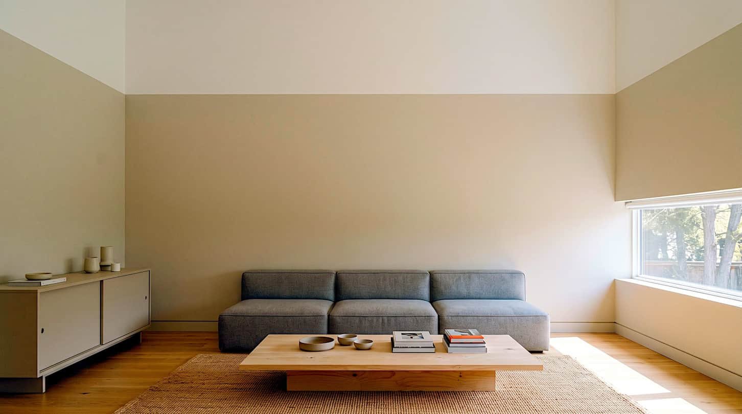
A room where every object sits at the same height reads as flat, regardless of how well chosen the individual pieces are. This is one of the beginner decorating mistakes that is easier to feel than to name, since nothing looks wrong at first glance.
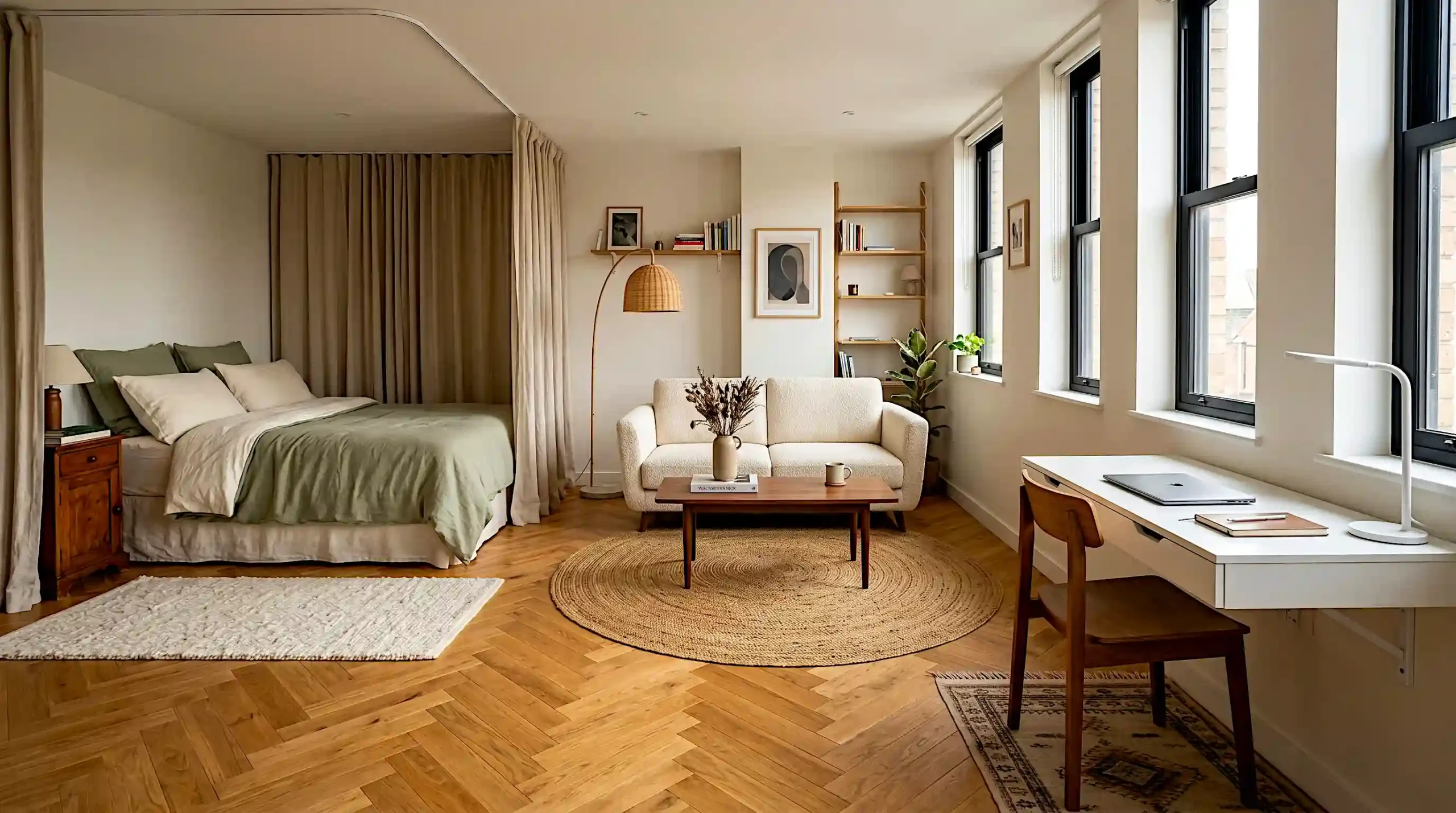
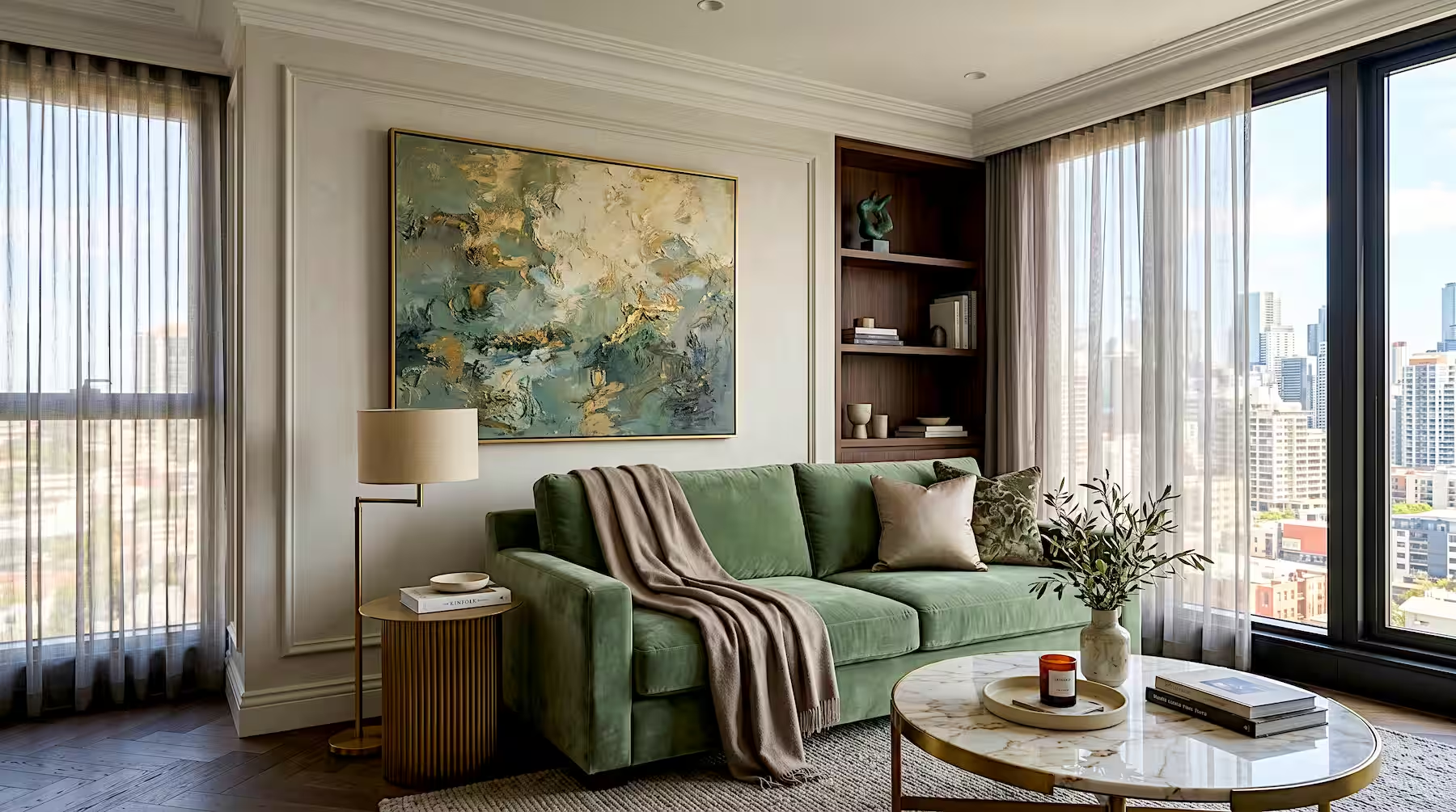
Combine at least three heights in every room. Add something low, like a rug or coffee table, and something mid level, like a sofa. Then add something tall, like wall art or a floor lamp, to carry the eye upward.
If a room still feels unfinished, check the wall space above your furniture. An empty gap there is often the missing height.
Layering height is often the difference between a room that looks furnished and one that looks finished, even when the furniture itself hasn’t changed.
Curtains Hung Too Low or Too Tight
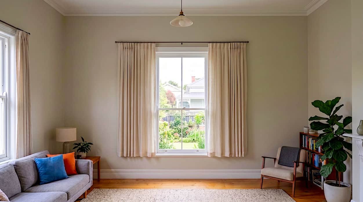
Mounting a curtain rod directly above the window frame makes the entire window, and the wall around it, look shorter than its actual size. This is an easy mistake to make since the window frame seems like the natural, obvious place to hang a rod.
Mount the rod 4 to 6 inches above the window frame at minimum, and closer to the ceiling if your wall height allows it. Extend the rod 4 to 8 inches past each side of the window frame so the curtains clear the glass when open. Both adjustments make the window read as taller and wider than its physical dimensions.
This fix costs the price of a slightly longer curtain rod and a few extra minutes with a drill, and it changes the proportions of the entire wall.
Too Many Accent Colors at Once
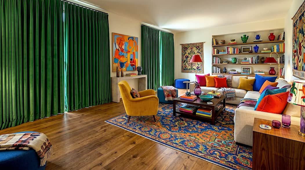
A single pop of color energizes a room. Five competing accent colors spread across pillows, art, and a rug in the same space reads as visual noise rather than personality. This mistake tends to build gradually, one colorful piece added at a time, without checking it against everything already in the room.
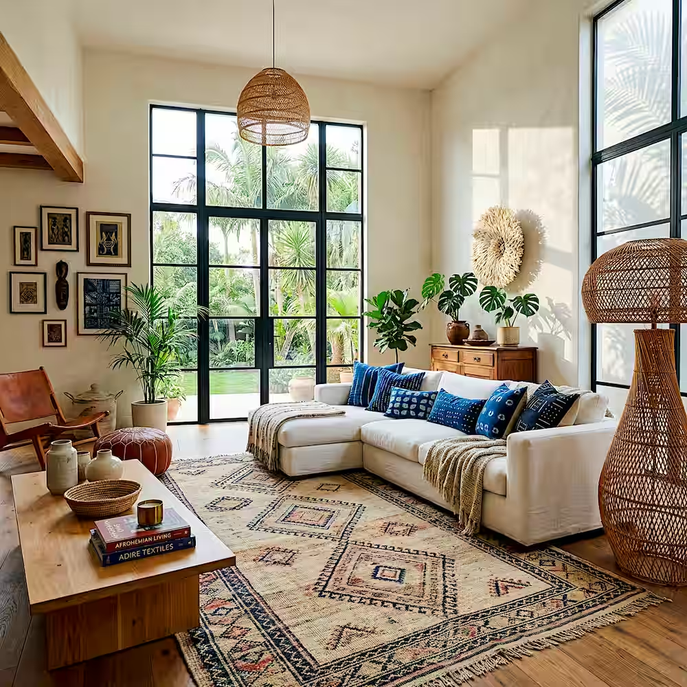
Limit a single room to two accent colors beyond its neutral base. If several colorful pieces already exist in the space, group them by warm or cool undertone rather than mixing both temperatures together. A quick photo of the room, viewed at a glance rather than piece by piece, often reveals a color clash that’s invisible up close.
This restraint applies even in rooms meant to feel bold and maximalist, since even a busy room needs an underlying color logic to avoid looking chaotic.
Leaving a Wall Bare Above Key Furniture
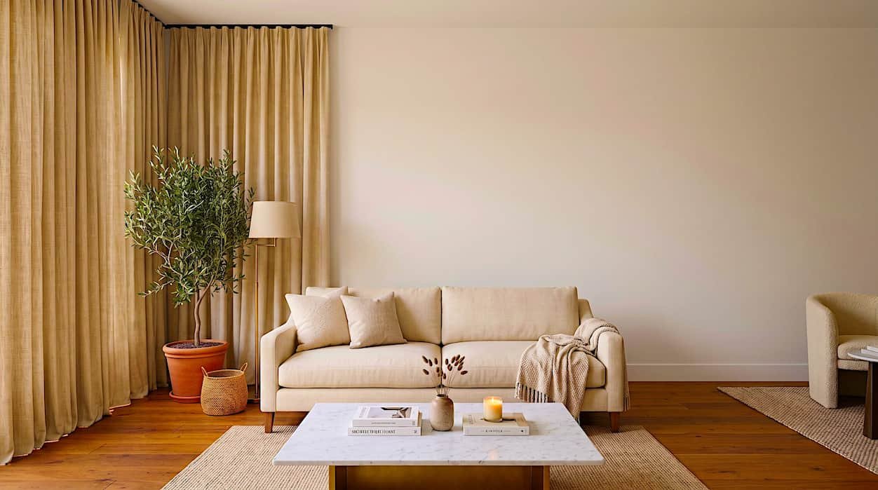
An empty wall above a sofa, bed, or console table makes a fully furnished room feel unfinished, even when every other element is in place. This mistake often lingers because filling that space can feel optional until the rest of the room is done.
Art or a mirror positioned above a sofa should span roughly two-thirds of the furniture’s width and hang 6 to 8 inches above the back cushion. The same width ratio applies above a bed, measured from one edge of the headboard to the other.
This single proportion rule works across almost every furniture and wall combination, which makes it one of the fastest fixes on this list to apply without any guesswork.
No Clear Focal Point
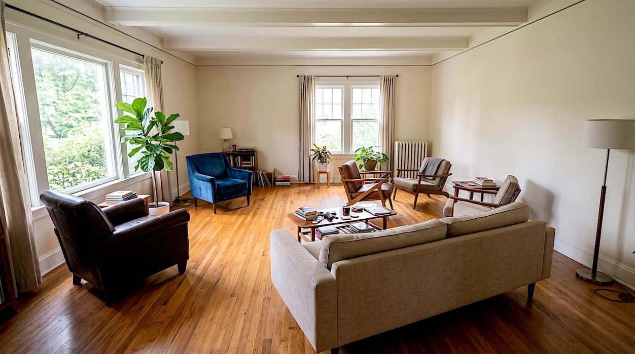
A room where seating faces in different directions, with no shared point of interest, feels directionless. Guests entering the space often aren’t sure where to sit or what to look at, even if every chair is individually comfortable.
Choose one focal point per room, whether that’s a fireplace, a television, a window view, or a single piece of art, and arrange the main seating to face it directly. Every other element in the room, from side tables to lighting, can then build outward from that single anchor instead of competing with it.
Rooms with one clear focal point photograph better and feel calmer to sit in. That single anchor often makes a space feel professionally designed instead of accidental.
Frequently Asked Questions
Buying a rug that’s too small for the seating area tops the list. Most starter budgets favor a smaller rug, but an undersized one makes an otherwise well furnished room look unplanned and disconnected.
Measure your room’s width and leave at least 30 inches of walking space around each major piece. If you can’t move comfortably around the sofa or coffee table, the scale is likely too large for the space.
No. Colors only need to share a warm or cool undertone. Two accent colors from the same tonal family read as intentional, while several unrelated bright colors compete for attention in the same space.
Most fixes cost nothing at all. Repositioning furniture, adjusting curtain rod height, and matching bulb temperature are free or under 20 dollars, since they involve placement and proportion rather than new purchases.
Mount it at least 4 to 6 inches above the window frame. If ceiling height allows, mounting closer to the ceiling makes the window and the wall around it look noticeably taller.
Recent Posts
How to Hang Heavy Art Without Drilling Holes
Beginner Decorating Mistakes That Age a Room Fast